SDG Tracker Dashboard
Year: 2018
Design: PuntoAparte & Show 'n Tell Data
Technologies: PHP, MySQL, D3.js
The INEC is the National Statistics Institute in Ecuador. They had the need to visualize their advancements in reaching the Sustainable Development Goals (SDGs) using their own data for the indicators of their choosing.
Requirements
- Visualizations of different indicators over time and separated by province
- The visualizations should adjust to the data that is available
- The possibility to add and edit data for the different indicators
- The possibility to link
pdfdocumentation to the indicators
Solutions
In collaboration with Cepei and PuntoAparte I developed a dashboard for the different indicators the INEC had with relationship to the SDGs. The main goal was to make sure that the visualizations could adjust to different data types as well as the different levels of availability of the data. In most cases indicators would have data over time and in some cases data was available separated by province.
For this a separate database was created, and the data is loaded through a custom PHP backend into the different visualizations. Those visualizations will adjust on the client side depending on the type of data (percentage, number, ratio or currency) and the data availability. The first image below shows a visualization of a percentage datatype for which data was available over time as well as separated by province.
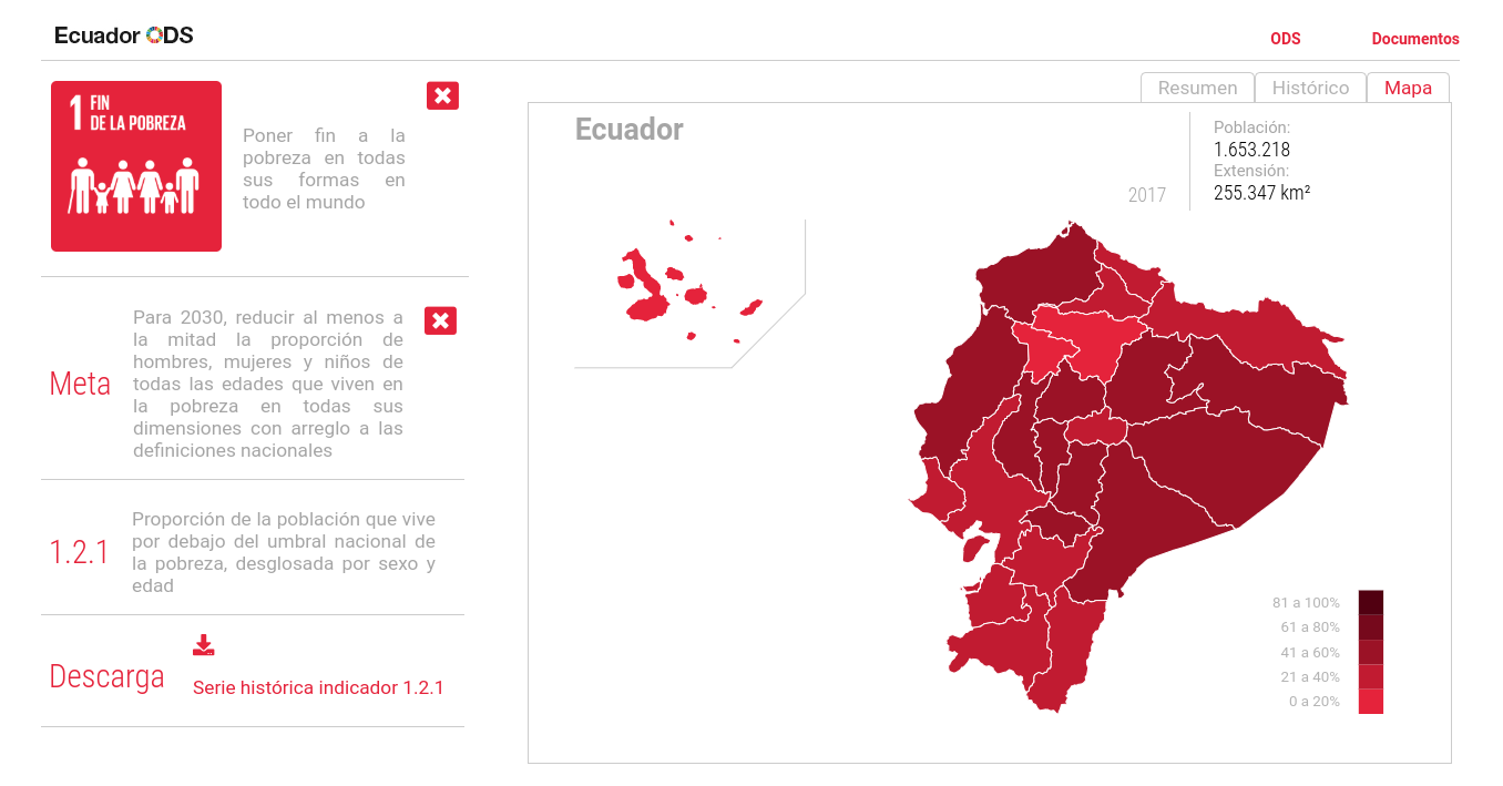 |
| A view of a percentage type indicator separated by province |
The second image is one where the data type is a ratio (deaths per 100,000) and the data was only available over time.
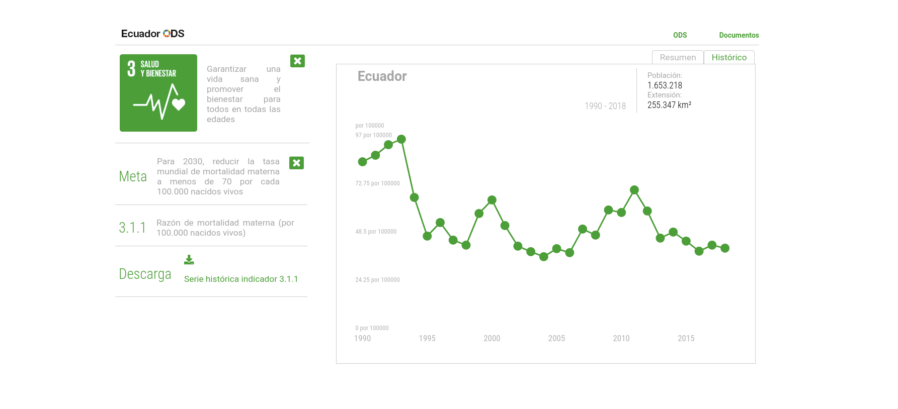 |
| A view of a ratio type indicator over time |
Everything adjusts on the client side, meaning that depending on the SDG chosen, the color of the visualization changes, and depending on the datatype and data availability the data visualizations change. In addition to that, if additional data would become available in the future, the visualizations automatically adjust if new visualizations can be created from the new data.